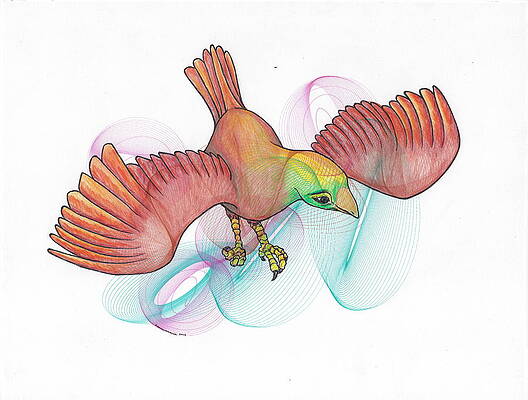
For this project, we wanted to create various harmonograph artworks. Our inspiration was the exhibit at the Wendell Museum: they had drawings that used several Lissajous curves and the golden ratio to draw non-living and living objects such a snail shell and a butterfly.
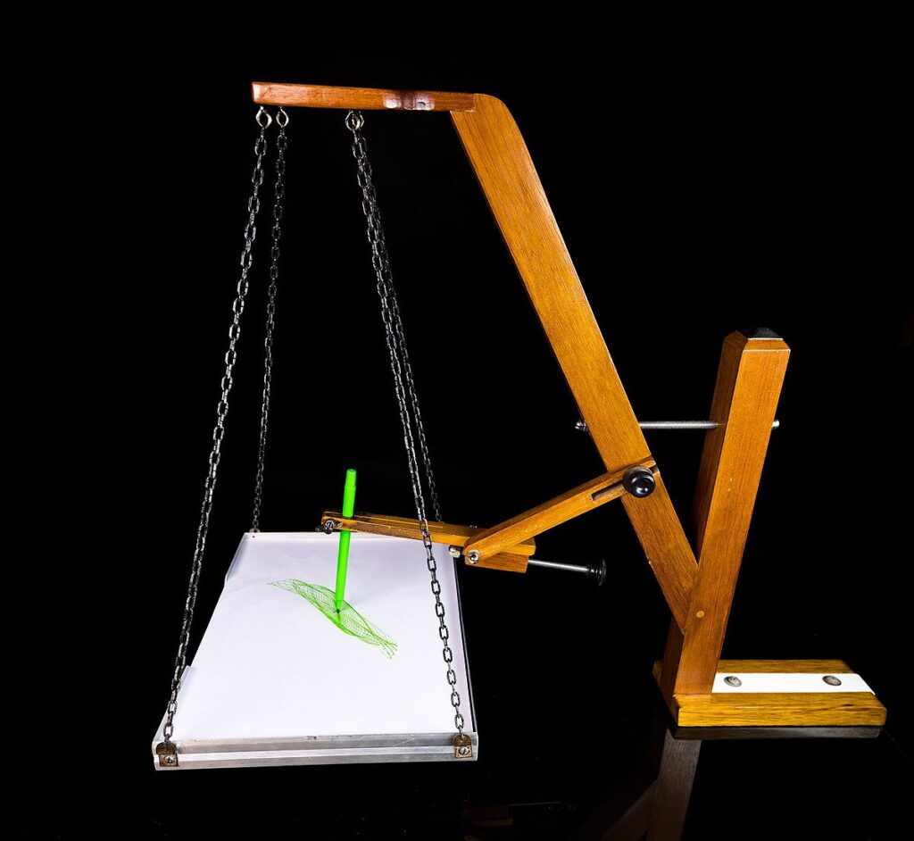
For some context, a harmonograph is a mechanical apparatus that employs two pendulums to create a geometric image. The drawings created typically are Lissajous curves or related drawings of greater complexity. Initially, we wanted to build a 3-pendulum harmonograph using wood, but due to time constraints, we pivoted to pen-plotting the harmonographs using the Axidraw v3.
Math Behind Harmonographs
A harmonograph creates its figures using the movements of damped pendulums. The movement of a damped pendulum is described by the following equation:
Here, f represents frequency, p represents phase, A represents amplitude, d represents damping and t represents time.
Trigonometric functions are crucial for harmonographs because they generate the oscillatory patterns using periodic waveforms that are symbolic to visuals such as the harmonograph.
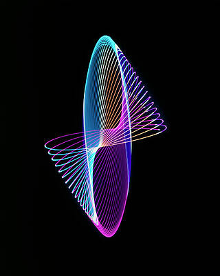
The Lissajous curves are a family of curves that describe complex harmonic motion patters resulting from the combination of two perpendicular harmonic oscillations. When the ratio of frequencies between the two oscillations is a simple rational number such as 1:1 or 3:2, the curves resemble simpler shapes such as straight lines, ellipses, and circles. As the frequency becomes increasingly irrational, so does the curve’s intricacy.
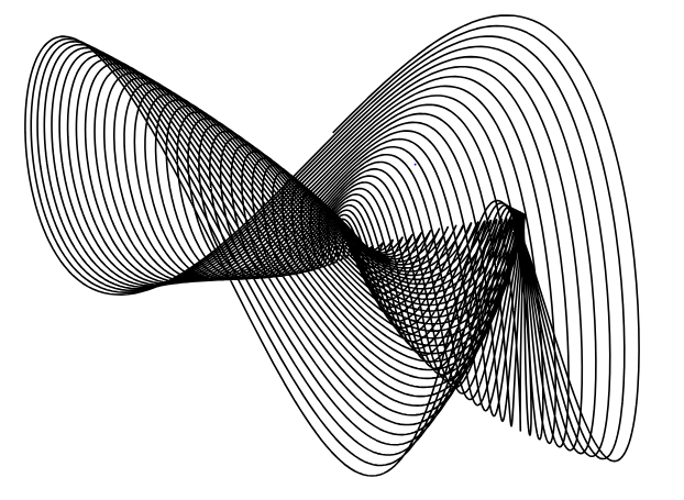
An appropriate computer program can translate these equations into a graph that emulates a harmonograph, and that was the route we took for our project. By changing the parameters, the overall shape of the generated graphs changes in several interesting ways.
The Process
Before starting to create each graph, we took a look at a bunch of inspiration online, mostly from Fine Art America.
We decided to focus on generating harmonographs instead of trying to model the drawings after images.
We first used VS Code to create a python program that would generate SVG files of the harmonographs. We then opened the generated SVGs in Inkscape and connected Inkscape with Axidraw to physically plot them on sheets of paper.
To get a sense of the code we used the following functions:

We played with the following set of parameters:

Attempt 1
None of us had previously used Inkscape or Axidraw so when we first tried running the software, we kept running into this issue and weren’t actually able to print anything.

Over time, we realized that there had been a preset setting that was on that was messing with the Axidraw and we eventually got it to work!
As we were plotting these graphs the first time, we ran into quite a few issues.
The first couple of runs, the pen started too high so it wouldn’t actually plot and then we had it too low so the paper would start with a giant dot where the pen began.
There was no way of telling where the pen plotter would start on the paper and it would change its start location every time so we would have to move the paper as soon as the pen plotter began.
Additionally, given how ink heavy some of our initial harmonographs were, the paper would start to bleed very quickly. We realized we needed to switch pens, play with the line thickness, and mess with the step count.
We found that we had significantly better results when we used a fine tip pen versus a felt tip pen. Lastly, we also realized we needed to pad the surface of the table with a mat for better results in order to ensure a flat, uniform surface.
Attempt 2
After playing with all of the parameters, we decided on the final four SVGs to try and plot out. While finalizing the graphs, some things we kept in mind was the amount of ink we would need to use, curve intricacy, and plot time.
When we tried plotting these for the second time, the pen plotter wasn’t behaving so we didn’t get a set of perfect prints, but here are a few:


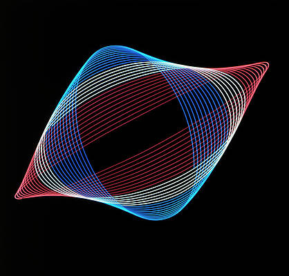
Out of these, the blue turned out the best, but the Axidraw plotted this weird boundary line that we couldn’t remove. After this first blue one, the pen plotter wasn’t able to plot any of the others despite the designs being relatively simple.
Next Steps
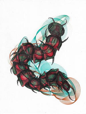
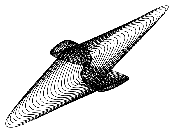
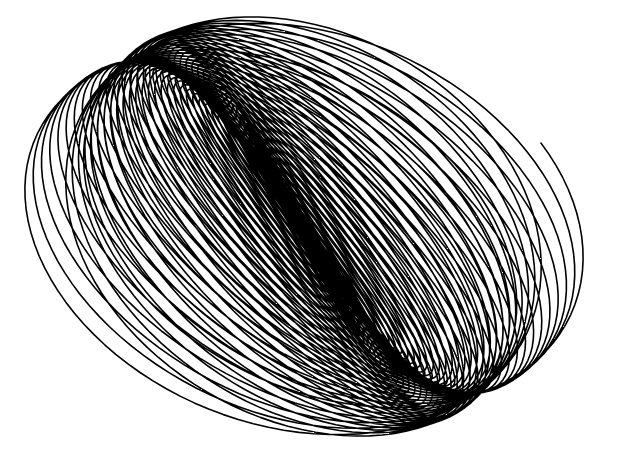
Some cool next steps could be trying to build a wooden two-pendulum model and reproduce these plots with our own physical model. Additionally, we could try simulating harmonographs off of actual objects. For example, the harmonograph pictured below could resemble a walnut shell or a fingerprint.

With some more complex coloring and some more parameter tweaking, we could build off of these existing graphs to closely replicate real-world objects.
Leave a Reply